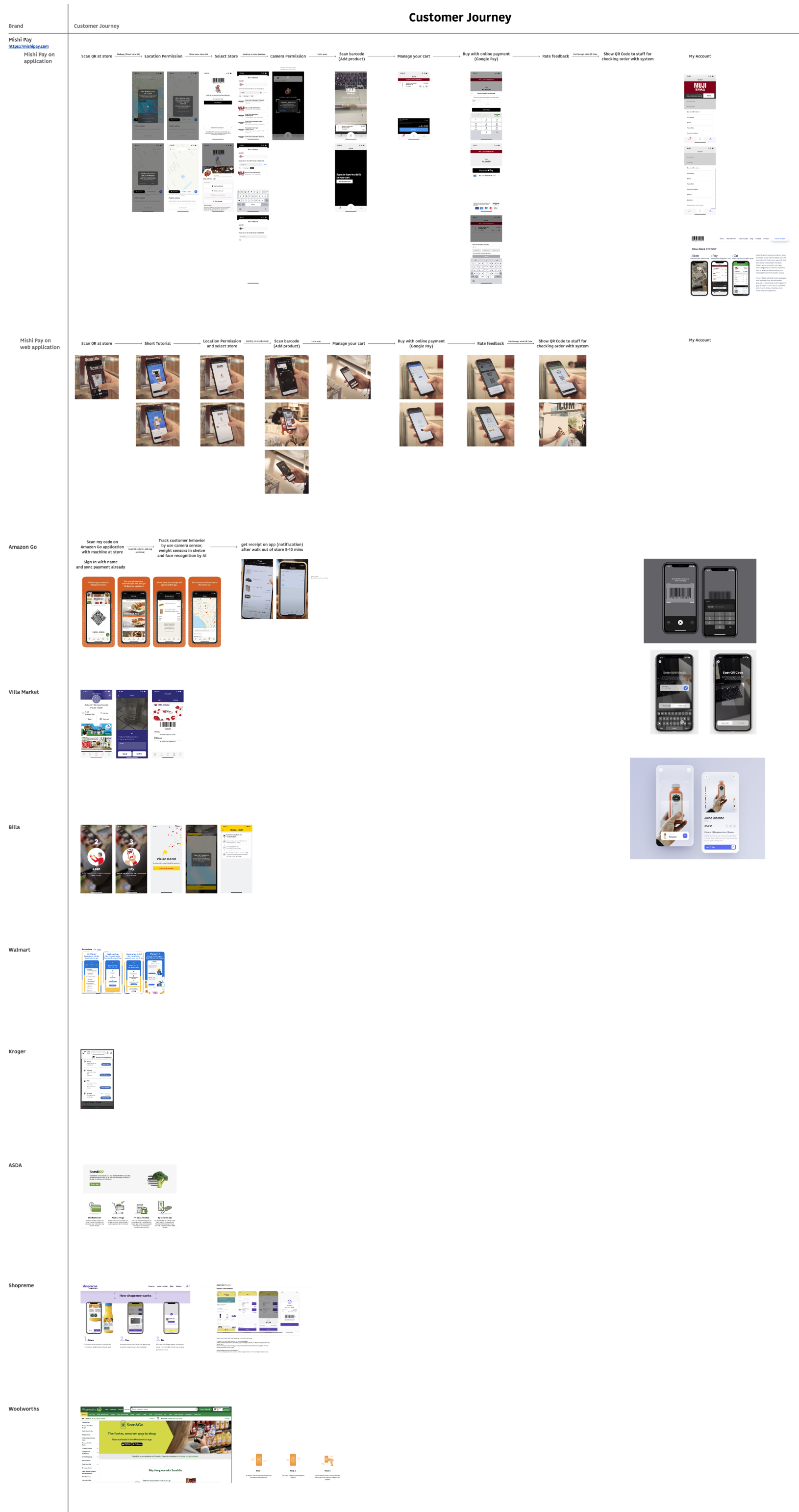
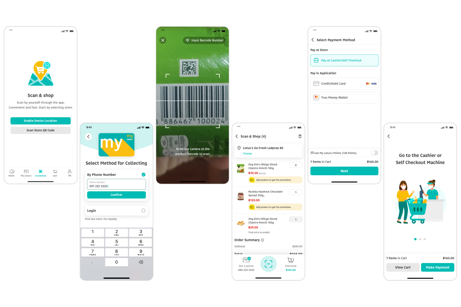
Unlike most apps that operate entirely online, this project tackled the complexity of connecting offline and online shopping experiences a first in Thailand. Extensive research, competitor analysis, and in-depth behavioral observation were essential to understand how users naturally move between both worlds. The biggest challenge was rethinking and rewriting the entire user flow from the ground up, with no existing blueprint to follow.
![[interface] screenshot of core features (for an ai developer tools)](https://cdn.prod.website-files.com/698bdb87bbdb713fbc2e8655/69e1b116b537c4df51a40a2c_ltt.png)
Mobile Application
Figma · User Journey Map
8 months (Sep'21-May'22)
UX/UI Designer
2 UX, 1 PO and 3 Devs
Lotus's (Ek-chai Distribution)
Shopping at hypermarkets often comes with hidden friction, uncertain pricing, confusing promotions, and manual coupon calculations. Checkout becomes even more painful for loyalty members who must present a physical card or recite a phone number to collect points, leaving room for human error.
Researched 10+ international O2O products including Mishi Pay, Amazon Go, and Walmart studying each product's user journey to identify when users transition between offline and online touchpoints. Key focus areas included creating the smoothest possible offline-to-online handoff, understanding permission flows for user data access, and analyzing the different technologies each product utilized.
Conducted a comparative analysis across all researched products, evaluating strengths, weaknesses, and limitations of each. Findings were used to close existing gaps and inform our design direction, ensuring the product would better serve real user needs. Special focus was placed on Branding consistency, Loyalty feature integration, and designing a clear end-to-end flow that communicates intuitively.
Today's customers prioritize convenience, speed, accuracy, value, and data security. Every touchpoint across the journey was carefully considered and designed to address these expectations — ensuring each step of the user experience feels intuitive, trustworthy, and worthwhile.

![<subject>[interface] screenshot of the software interface (for a productivity tools business)</subject>](https://cdn.prod.website-files.com/698bdb87bbdb713fbc2e8655/69e2f2ef40147d374a83be11_survey.png)
Challenge: When finalizing the placement of the Scan As You Shop icon, the team narrowed it down to two design directions, each with distinct trade-offs that made the decision difficult. To resolve this, we conducted a survey with 23 users across diverse ages, occupations, and genders, collecting both quantitative preferences and qualitative feedback. The findings were used as a data-driven foundation to guide the final design decision.
Result: 65% of users preferred Design 1 placing the icon in the Bottom Navigation citing ease of discovery, one-handed accessibility, and familiarity with bottom-placed navigation patterns as the key deciding factors.

Challenge: A complete end-to-end user flow was mapped based on field observations and Lotus's existing assets. The flow was divided into two distinct payment processes, paying via POS and self-checkout through the app. Each with its own steps, details, and limitations that required careful and thorough consideration throughout the design process.
Result: Despite different payment methods, both flows were kept intentionally similar to minimize the learning curve. For unfamiliar steps, extra attention was given to the UI to ensure the experience remained as intuitive as possible.

Challenge: With the user flow finalized, UI design focused on user-centricity and Branding consistency. Each section required thorough consideration of all possible states, including alternative and error cases. Ensuring that every scenario was covered with clear content and UX writing to guide users through without confusion.
Results: Once the UI was complete, a Design Critique session was held with the team and stakeholders to identify gaps and discuss solutions collaboratively. The finalized design then went through an additional review by the Product Owner to ensure everything aligned with the product requirements.
The design was completed and approved by all stakeholders, but the product was ultimately not launched due to the absence of a dedicated technical team to carry it through to development. The end-to-end UX flow, UI design, and design documentation were fully delivered and handed off as planned.